Worked with BrandEd, online and experiential education partner to The New York Times and other iconic brands, to redesign their applicant portal and enrollment process.
ROLE
Product Design
UX Research
PLATFORMS
Responsive Web
01.
Problems + Opportunities
Uncertainty around term and course enrollments leads applicants to hedge bets and game the system.
Interviews revealed many students were anxious about applying to pre-college programs at institutions like The New York Times and Sothebys. Even if accepted, they might be placed in a course that didn't align with their interests or schedule. Consequently, many applicants prioritized the same class multiple times, while some admitted students later declined offers in favor of other opportunities. Though understandable, these behaviors further complicated an already challenging enrollment process for the Admissions team.
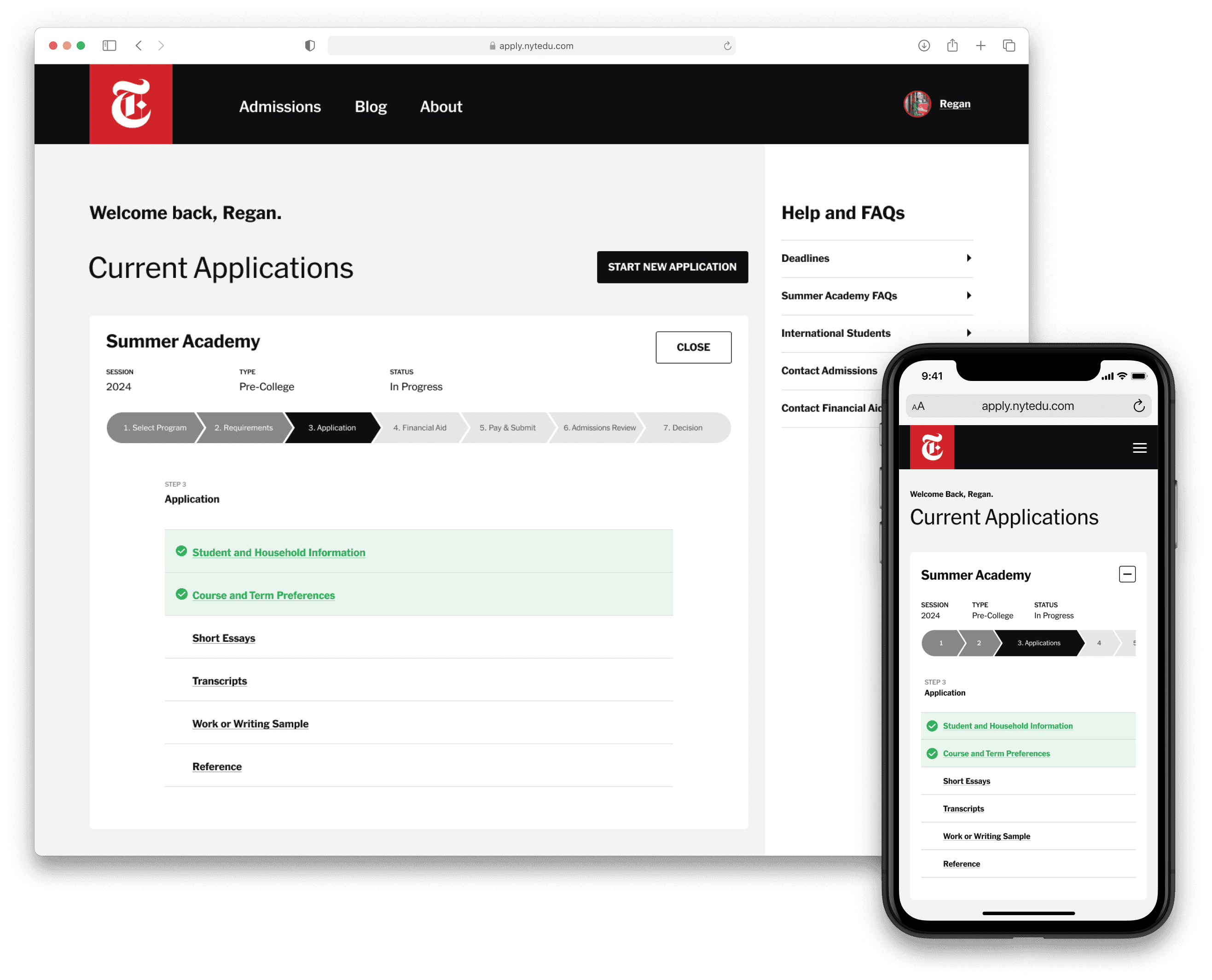
Applicants need a flexible but unambiguous path to completion and clear progress tracking to streamline the process.
The existing site presented the application as a linear, stepped process. But applicants' mental models were highly non-linear. They wanted to complete tasks iteratively, in small chunks, not all at once. Finally, the path to task completion was often unclear. Productivity suffered as students toggled between tabs and windows to consult FAQs and gather supporting materials.
You had to completely fill out one page before you could access the next one which was frustrating. I couldn't see all the [tasks] at once. If I had, I would've been able to plan my time better.
Efficiency and scale are constrained by manual, bespoke processes.
The existing enrollment process was entirely manual. The Director of Admissions placed each individual student in a course, attempting to balance class size and student preference in the process. The design and engineering teams took an equally bespoke approach to standing up applications for new brand partners and programs.
HOW MIGHT WE…
Empower students to complete the application in any order while keeping track of outstanding tasks and deadlines?
Define a clear visual and logical path to completion for every task?
Enable users to seamlessly continue where they left off working on a saved application?
Increase applicant confidence that they will be placed in a term-course combination they are satisfied with?
Reduce time and effort for Engineering and Design to stand up applications for new programs?
Minimize the manual work required to place students in courses?
02.
Flexible Path to Completion
Exploring navigation patterns to support non-linear workflows and reduce context switching.
I iterated through interaction models and wireframes of increasing fidelity to explore navigation structures that:
Define a clear path to completion
Afford a flexible order of operations
Enable users to save, return, and continuing working seamlessly.


03.
Optimize Course + Term Selection
Helping applicants secure enrollment in a course that aligns with their interests and schedule.
Increased applicant satisfaction with course/term enrollment would lead to more admitted students accepting offers and attending the program. User interviews revealed that some applicants exclusively prioritized a specific term or class. But most attempted to strike a balance between the two.
But the admissions team was hesitant to redesign a feature that had such an immediate impact on the bottom line. What if enrollments dropped after the redesign? To mitigate these risks, I designed low-fidelity prototypes to test three hypotheses with a small group of users.
USER TESTING PROTOTYPES
01. Prioritize term, then course.
Step one: Enter term availability.
Step two: Enter term preference
Step three: Rank top-five course preferences for each available term.
Assumption: Best for students who have limited availability but are flexible on course selection.
02. Prioritize course, then term.
Step one: Rank top-five course preferences.
Step two: Select the term availability for each course.
Assumption: Best for students who want to enroll in a specific course, but have flexible availability.
03. Prioritize term and course simultaneously.
Users can select term or course preferences at the same time.
Assumption: Best for students who care equally about course and term.
Users prefer Direction 02 for its comprehensive view of term availability across courses.
Users had the most favorable impression of Direction 02 and rated it the easiest to understand. It also inspired the most confidence that users would be satisfied with their course-term placement. However, we learned that what ultimately mattered most was the ability to select a course and see its availability across all four terms.

04.
Automated Enrollment
Defining business logic to eliminate costly manual processes and improve demand forecasting.
Finally, I worked with the Admissions team to define the logic for automated enrollment. For each of the four application cycles, a minimum enrollment threshold determines whether a student can be automatically placed in one of their top-choice courses.
For example, when a student applies before the priority decision deadline and their first choice class is less than 90% full, they are auto-enrolled. If not, the system compares availability for the second- and third-choice courses. Once these options have been exhausted, the student is routed to the Admissions team for manual placement.
Automated enrollment not only eliminated hundreds of hours of manual work, it also provided real-time visibility into demand for classes. Consequently, the Director of Admissions was able to better accommodate student preferences by scheduling more sections of popular courses.

05.
UI Kit
Standardizing components and templates to eliminate redundant design and engineering efforts.
To expedite the process of standing up applications for new partners and programs, I created a modular, theme-able kit of UI primitives, components, and templates. I also worked with my engineering counterparts to build a library of reusable components and to define workflows for maintaining alignment between the Figma and code.


06.
Outcomes + Impact
17%
Increase in application completion rate.
12%
Reduction in customer support requests.
53%
Reduction in time to stand up new applications.
60%
Reduction in manual enrollment.


